When we are
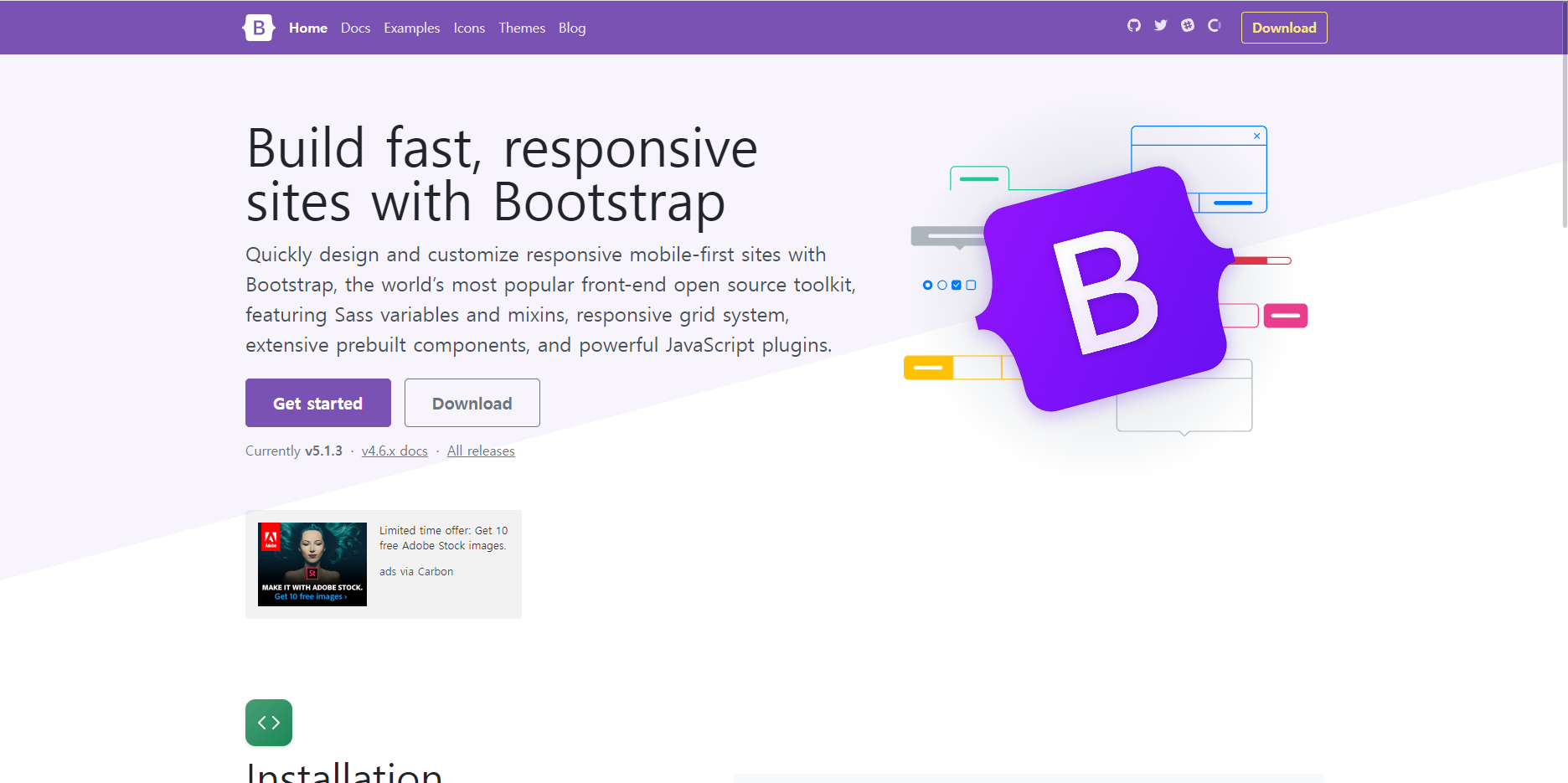
Bootstrap
The most popular HTML, CSS, and JS library in the world.
getbootstrap.com
- Accodion
<div class="accordion" id="accordionExample">
  <div class="accordion-item">
    <h2 class="accordion-header" id="headingOne">
      <button class="accordion-button" type="button" data-bs-toggle="collapse" data-bs-target="#collapseOne" aria-expanded="true" aria-controls="collapseOne">
        Accordion Item #1
      </button>
    </h2>
    <div id="collapseOne" class="accordion-collapse collapse show" aria-labelledby="headingOne" data-bs-parent="#accordionExample">
      <div class="accordion-body">
        <strong>This is the first item's accordion body.</strong> It is shown by default, until the collapse plugin adds the appropriate classes that we use to style each element. These classes control the overall appearance, as well as the showing and hiding via CSS transitions. You can modify any of this with custom CSS or overriding our default variables. It's also worth noting that just about any HTML can go within the <code>.accordion-body</code>, though the transition does limit overflow.
      </div>
    </div>
  </div>
  <div class="accordion-item">
    <h2 class="accordion-header" id="headingTwo">
      <button class="accordion-button collapsed" type="button" data-bs-toggle="collapse" data-bs-target="#collapseTwo" aria-expanded="false" aria-controls="collapseTwo">
        Accordion Item #2
      </button>
    </h2>
    <div id="collapseTwo" class="accordion-collapse collapse" aria-labelledby="headingTwo" data-bs-parent="#accordionExample">
      <div class="accordion-body">
        <strong>This is the second item's accordion body.</strong> It is hidden by default, until the collapse plugin adds the appropriate classes that we use to style each element. These classes control the overall appearance, as well as the showing and hiding via CSS transitions. You can modify any of this with custom CSS or overriding our default variables. It's also worth noting that just about any HTML can go within the <code>.accordion-body</code>, though the transition does limit overflow.
      </div>
    </div>
  </div>
  <div class="accordion-item">
    <h2 class="accordion-header" id="headingThree">
      <button class="accordion-button collapsed" type="button" data-bs-toggle="collapse" data-bs-target="#collapseThree" aria-expanded="false" aria-controls="collapseThree">
        Accordion Item #3
      </button>
    </h2>
    <div id="collapseThree" class="accordion-collapse collapse" aria-labelledby="headingThree" data-bs-parent="#accordionExample">
      <div class="accordion-body">
        <strong>This is the third item's accordion body.</strong> It is hidden by default, until the collapse plugin adds the appropriate classes that we use to style each element. These classes control the overall appearance, as well as the showing and hiding via CSS transitions. You can modify any of this with custom CSS or overriding our default variables. It's also worth noting that just about any HTML can go within the <code>.accordion-body</code>, though the transition does limit overflow.
      </div>
    </div>
  </div>
</div>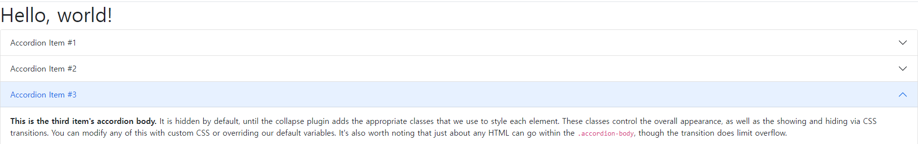
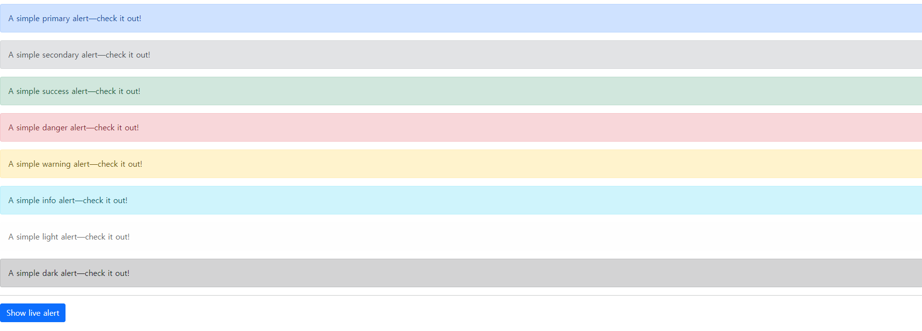
- Alert
<div id="liveAlertPlaceholder"></div>
<button type="button" class="btn btn-primary" id="liveAlertBtn">Show live alert</button>

  <script type="text/javascript">
  var alertPlaceholder = document.getElementById('liveAlertPlaceholder')
  var alertTrigger = document.getElementById('liveAlertBtn')

  function alert(message, type) {
	  var wrapper = document.createElement('div')
	  wrapper.innerHTML = '<div class="alert alert-' + type + ' alert-dismissible" role="alert">' +
	  message + '<button type="button" class="btn-close" data-bs-dismiss="alert" aria-label="Close"></button></div>'

	  alertPlaceholder.append(wrapper)
	}

	if (alertTrigger) {
	  alertTrigger.addEventListener('click', function () {
	    alert('Nice, you triggered this alert message!', 'primary')
	  })
	}
To be continue
'Front > Bootstrap' 카테고리의 다른 글
| [Bootstrap] 부트스트랩 공백의 개념 (0) | 2022.03.25 |
|---|---|
| [Bootstrap] pagination, Spinners, Toggles, Toasts (0) | 2022.01.24 |
| [Bootstrap] Group-button tools (0) | 2022.01.21 |


